Guidelines to ensure flawless prepress artwork are critical to the success of flexo printed flexible packaging.
Here we have summarised the key points to provide a comprehensive resource for designers.
Mastering Typography: Finding the Balance
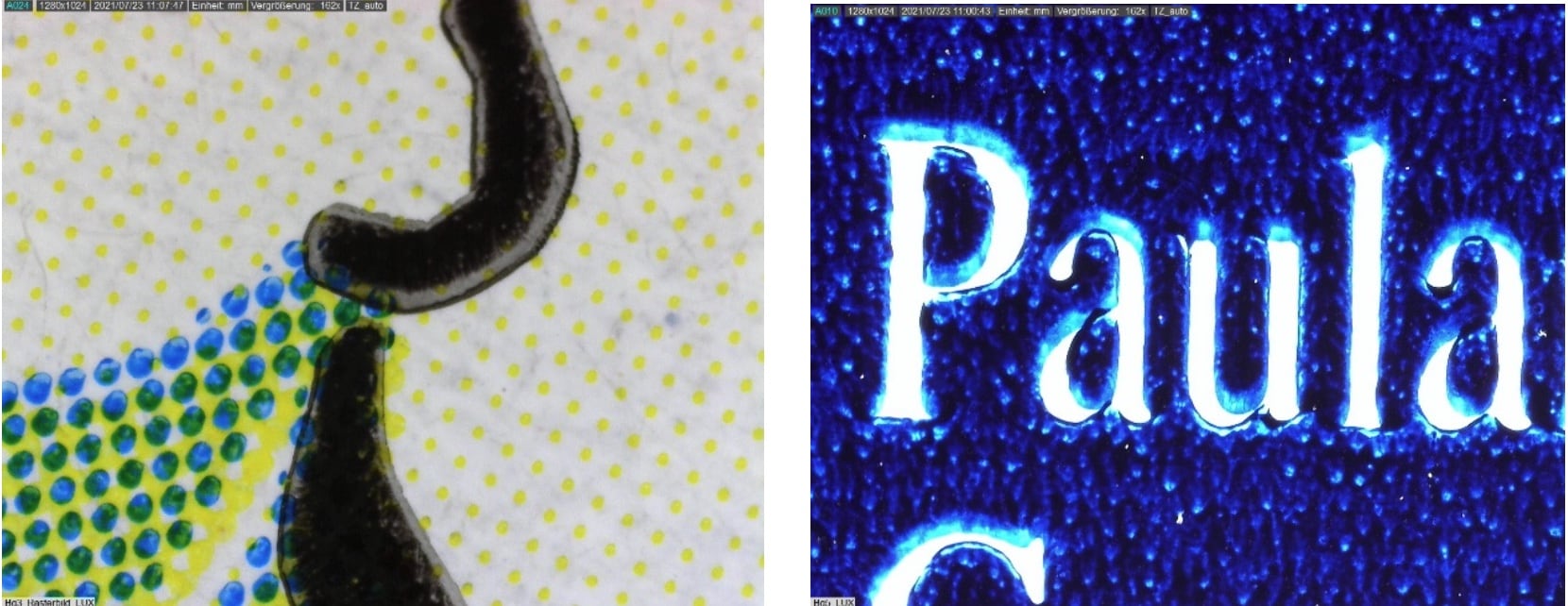
Understanding the nuances of typography in the printing process is paramount. As detailed as the first guideline, the characteristics of the flexographic process can affect text reproduction. Positive text tends to thicken, while reverse text can lose fine details such as serifs.
Font selection therefore requires careful consideration. Typically, the minimum positive stroke size is 0.007″ (0.5 pt), while the minimum reverse stroke size is 0.01″ (0.7 pt). It is recommended that font sizes and styles be confirmed with the printer to account for system-dependent factors.
Design Finesse: Restrained Use of Colour
Efficient design with minimal use of colour is the key to effective packaging. This guideline advocate minimising multi-colour elements to effectively achieve design goals. Emphasising trapping and hold back techniques for cohesive design integration, while seeking approval for design changes when necessary, ensures visually appealing and functional packaging solutions.
Trapping Techniques: Perfecting Colour Overlaps
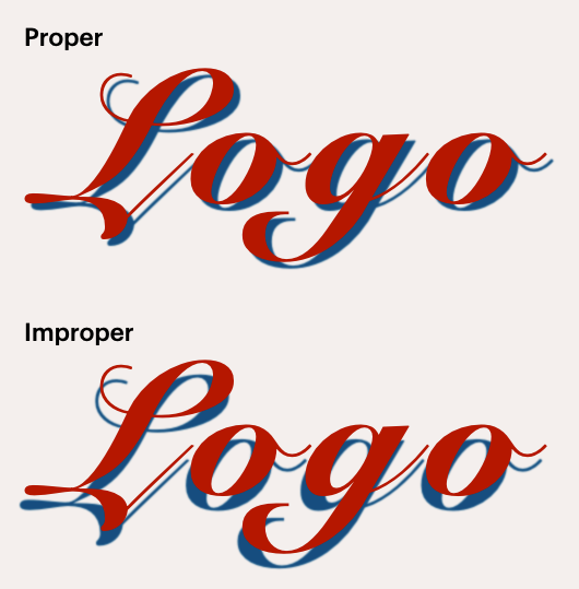
Trapping, as the third guideline, plays an important role in ensuring accurate colour overlaps. The recommendation to “spread” or enlarge the lighter colour under the dominant colour helps create seamless transitions. Detailed trapping instructions for vector and raster images, as emphasised in the second text, help to achieve flawless print results.
 © Anyflexo
 © Anyflexo
Gradient Mastery: Seamless Blends
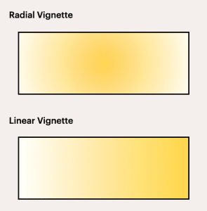
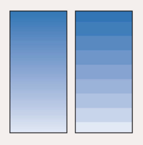
Gradients are a design element that requires special handling to ensure optimal print results. Unless a specific vignette effect is desired, setting gradients to 1%-100% dot ensures consistent fading. Specifying gradient and blend preferences in the final art layout, such as overprints or effects, is essential for accurate reproduction.
 © Anyflexo
 © Anyflexo
Structural Integrity: Respect Guidelines
Maintaining the structural integrity of the artwork, also as emphasised guideline, is imperative. Respecting the structure provided by GPI and not altering die elements are fundamental principles. Ensuring that bleeds align with specified dimensions and following single knife guidelines are essential to avoid design inconsistencies.
Set die-lines to a spot colour and rename as “Die-line”. Die-line is the key to good placement of elements in a design. Bleeds should be set to at least 1/16″ from trim (die-line). Also, bleeds should be 2 mm around art board.
Quiet Zone: Precision in Handling UPC
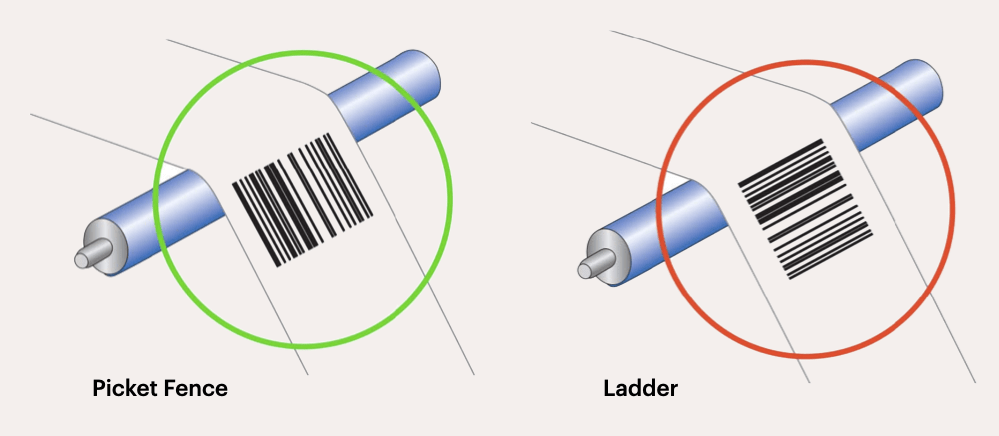
The guideline for handling UPCs focus on meticulous details for barcode efficiency. Barcodes are a critical part of packaging design. This guideline emphasise the importance of barcode legibility for successful scanning. Recommendations include printing barcodes in 100% black on a white background to maximise readability. Bar code orientation is also critical.
 © Anyflexo
Ensuring a defined “quiet zone” around bar codes and adhering to orientation specifications are essential for efficient scanning and product identification. The “quiet zone”, or no‐print area, should be at least 1/8″ on either side of the code bars. Bar codes should be no smaller than 85% and no larger than 120%. Adherence to minimum quiet zone widths, proper barcode alignment, and proper spacing between elements facilitate smooth printing processes and accurate barcode scanning.
Coating Considerations: Enhancing Visual Appeal
Coatings add aesthetic and protective value to packaging designs. Strict adherence to approved coating samples, as highlighted as another guideline, ensures consistent and appealing results. Collaboration with GPI’s structural design department on coating modifications ensures that approved enhancements are seamlessly integrated into the design.
Conclusion
Combining these essential guidelines for artwork provides designers with a comprehensive roadmap for navigating the challenges of flexible packaging prepress stage in flexo processes. Ensuring typographic finesse, mastering trapping and gradient techniques, adhering to structural and coating requirements, and executing UPC handling with precision are fundamental steps in creating visually stunning and functionally effective packaging designs.

